Roy was born in New York. He studied at the Art Students' League, New York, and at Ohio State University, Columbus. He taught at Ohio State University, New York State University, Oswego and Rutgers University. He did his military service in Europe. He had his first one-man exhibition in 1951 and worked as a commercial artist until 1957. He painted parodies of American twenties' art such as Remington's cowboy-and-Indian scenes. He used elements of commercial art, comics and advertisements in his drawings and painting. He produced large format paintings for the New York State Pavilion at the World's Fair in New York. He was represented at the Venice Biennale in 1966, 1968 and 1970 and in 1967-68 he had a retrospective at the Pasadena Art Museum.
|
|
 Viewer |
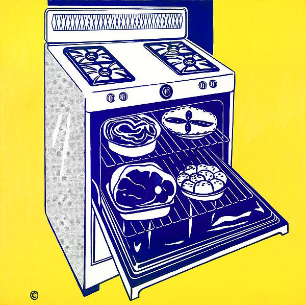
Kitchen stove 1961-62 oil on canvas 173.0 (h) x 173.0 (w) cm signed and dated reverse support u.l., crayon, "rf, Lichtenstein/ 61-62" National Gallery of Australia Discussion of the work In the summer of 1961 Lichtenstein abandoned the Abstract Expressionist style of earlier works and began to use commercial art as subject-matter in his painting. Kitchen stove, painted in the winter of 1961-62, was one of the first of those works. The source of Kitchen stove was probably an advertisement. The painting mischievously retains the copyright symbol, located in the lower left-hand corner, and the Ben Day dots used by printers to reproduce tone. The Ben Day dots in Kitchen stove and other early works are laboriously reproduced by hand, and only later by mechanical means. Lichtenstein stated that it was his intention to follow the original commercial reproduction as closely as possible: 'The closer my work is to the original the more threatening and critical the content'. Colour in Kitchen stove is limited to yellow and blue, typical of the restricted palette of these early works. Lichtenstein explained in a 1971 interview that he was: looking for the most contrast. Each colour had a certain character to me: the yellow was acid, and a colour that seemed to contrast as much as possible with it was a blue that was almost violet … I got some of these colours from supermarket packaging. I would look at package labels to see what colours had the most impact on one another. The idea of contrast seemed to be what advertising was into in this case. An advertisement is so intensely impersonal!'. |
| Grrrrrrrrrrr | Preparedness | Interior with Mirrored Wall | Stepping Out | House | Kitchen stove | Times Square Mural |
| Renowned Artists Gallery index (61 galleries)
Other Parts of the Permanent Gallery | ||
| Digital Color Winners 2004 and 2005
Digital Color Winners 2002 and 2003 Digital Color Winners 1999, 2000 and 2001 |
Watercolor Painters
Oil Painters Pen and Pencil Artists |
Photographers
Sculptors Authors |